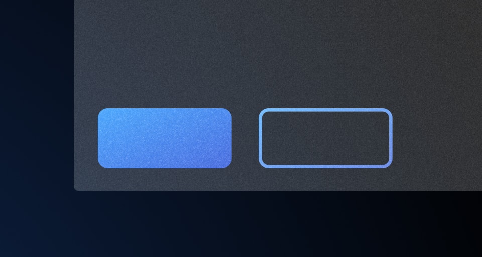
Use a button set to ensure a consistent layout when using multiple buttons in a single row.
Usage
Usage documentation for this component is coming soon. In the meantime, help us improve this documentation by letting us know how your team is using it in #team-design-systems (internal only).
More detailed examples and guidance around button alignment, grouping, and organization can be found in the button organization pattern documentation.
How to use this component
The basic invocation requires two or more buttons to be provided as children:
<Hds::ButtonSet>
  <Hds::Button @text="Submit" type="submit" />
  <Hds::Button @text="Cancel" @color="secondary" @href="https://hashicorp.com" />
</Hds::ButtonSet>
Equal width buttons
If you want to have buttons with equal width, apply a width (via inline style or CSS class) to the ButtonSet container and the argument @isFullWidth=true to the Button components:
<Hds::ButtonSet >
<Hds::Button @text="Save" @isFullWidth= />
<Hds::Button @text="Cancel" @color="secondary" @href="https://hashicorp.com" @isFullWidth= />
</Hds::ButtonSet>
With loading state
This technique is useful if you need to show a loading state, to avoid the resizing and shifting of the buttons:
<Hds::ButtonSet >
<Hds::Button
@icon=
@text=
@isFullWidth=
/>
<Hds::Button
@text="Cancel"
@color="secondary"
@isFullWidth=
/>
</Hds::ButtonSet>
Component API
…attributes
...attributes.


